Nowadays it's not enough to have a website that only works on computer screens. With 4,770,000,000+ (4.77 billion) people across the globe using a mobile phone, you need to make sure your website works on their phone. That's a lot of people, and you can guarantee that potential customers will bounce if they can't see your website on their phones!
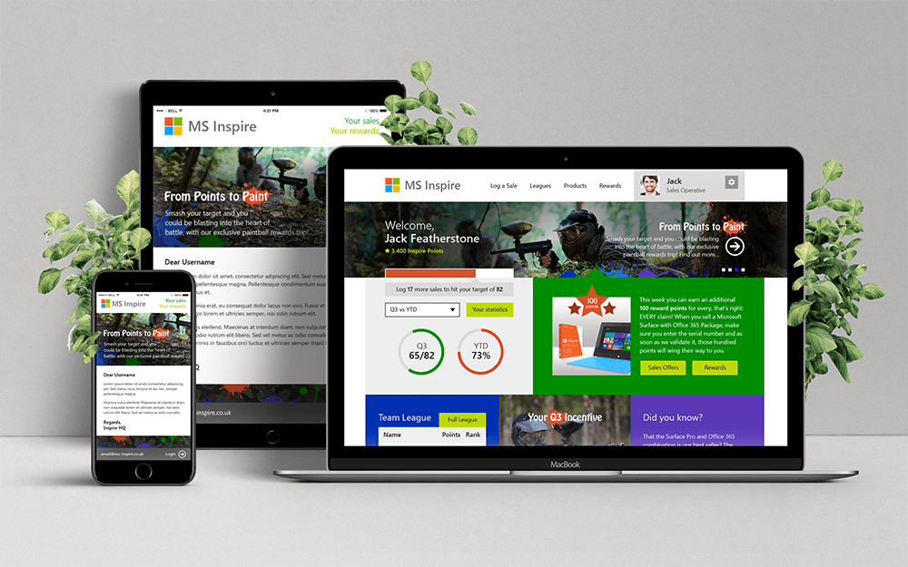
If websites are designed responsively, it means they adapt and respond to whatever screen size they're on, on any device. You'll see differences in layout between your desktop and phone, but all the content will be there.
At THEUXDESIGNER we design mobile-first, which helps to prioritise how things are displayed on mobile. For example, if you have a homepage banner with news updates, that should be near the top of the screen. You have less screen real-estate to play with and you can only fit things vertically, on top of each other. Prioritising this way really helps work out what to display on larger screens like desktops, and prevents 'design by committee' decisions (this is where every stakeholder sees a space on the homepage just for them, leading to overcrowding and no visual hierarchy: it's bad!).
It's best practice to design from the ground up, and designing mobile-first means content can efficiently expand rather than everything being forced to collapse if designing on desktop first. Plus, you get fewer issues in development this way. We thoroughly test the full responsiveness of every website we develop. So you can be assured that from the minimum size of 300px to the maximum screen width of 2560px, everything is displayed exactly how intended. No need for costly maintenance of two sites and no customers leaving because they can't read the tiny font on their screens. Nice.


.png)

.png)
