Nowadays it's not enough to have a website that only works on computer screens. With 4,770,000,000+ (4.77 billion) people across the globe using a mobile phone, you need to make sure your website works on their phone. That's a lot of people, and you can guarantee that potential customers will bounce if they can't see your website on their phones!
In 2007-2012, the first smartphones became, well, smart. And a lot of companies realised they needed to capitalise on the trend towards mobile websites. They started making two versions of their sites, a www.websitename.com and a m.websitename.com. This meant double the work, twice as much effort to maintain both sites and countless errors as a result of conflicting versions.
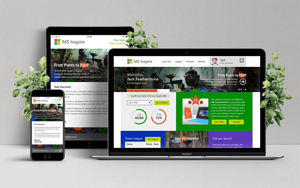
Fast-forward to 2017, where responsive design is so common you barely see any websites with the .m prefix any more. Instead, like the photo above, websites adapt and respond to whatever screen size they're on, on any device. This means you'll see differences in layout between your desktop and phone, but all the content will be there. We thoroughly test the full responsiveness of every website we develop. So you can be assured that from the minimum size of 300px to the maximum screen width of 2560px, everything is displayed exactly how intended. No need for costly maintenance of two sites and no customers leaving because they can't read the tiny font on their screens. Nice.


.png)

.png)
